|
|
|
Sept 17, 2023 11:23:27 GMT
|
|
Okay here we go,
Made the new theme the absolute default as I prepare the mobile desktop to be the default desktop view.
Bugs and issues please. Now the editor is back to the default editor the only real change for desktop is the menu layout and the thread listing. For mobile obviously the mobile desktop view should be a lot better now, and I'll be working to improve it more, based on feedback and based on what other successful modern forums are doing on mobile views.
Spot any anomalies or anything weird drop it in here. There is a point this coming week (commencing 18th) that I'm going to flip the switch to default the desktop view on mobile. I will brace at that point for the maximum amount of complaint, but please be gentle, I'm trying to make all this work as best it can for the future of the forum.
I PUSHED THE "MOBILE VIEW IS DESKTOP VIEW" BUTTON. ... DON'T YELL AT ME
Please report issues and I'll fix them as quick as I can.
Enhancements/improvements will be happening too, but want to make sure we're stable first.
|
| |
Last Edit: Sept 19, 2023 9:04:02 GMT by HoTWire
|
|
|
|
The Doctor
Club Retro Rides Member
Posts: 3,434
Club RR Member Number: 48
|
|
Sept 17, 2023 13:36:05 GMT
|
You're doing great work! Switched over to the new desktop layout on mobile and now not going back, I like it! Minor thing, it's not clear which parts of the forums have new posts on mobile in portrait, while it is shown in landscape (bit like what you fixed for the threads a couple of days ago) 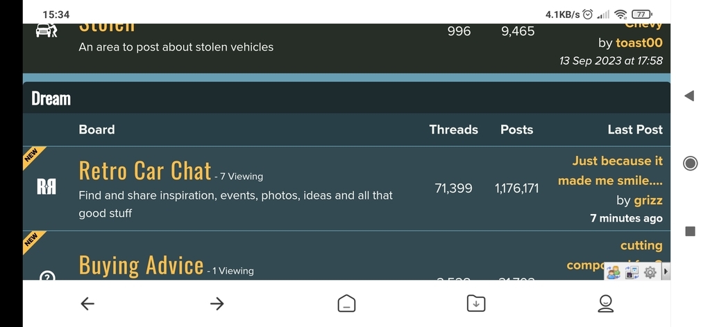 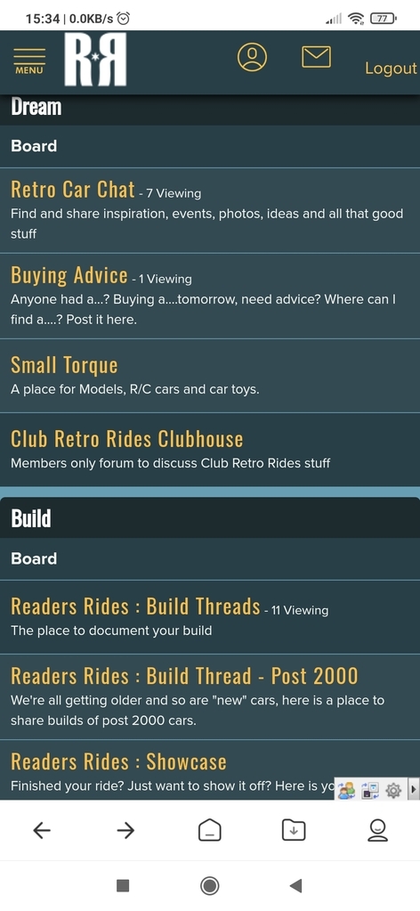 |
| |
Last Edit: Sept 17, 2023 13:37:27 GMT by The Doctor
|
|
60six
Posted a lot
 (╯°□°)╯︵ ┻━┻
Posts: 1,658
|
|
Sept 17, 2023 22:32:11 GMT
|
|
Can I just say how good this new layout is beginning to turn out? You had a vision I defintely couldn't see and amongst much criticism you stuck with it and now I see where you are going ....
Love the new font, and impressed with your use of colour, although this comes from someone with colour blindness so ....
|
| |
Some 9000's, a 900, an RX8 & a beetle
|
|
|
|
|
Sept 18, 2023 7:54:09 GMT
|
You're doing great work! Switched over to the new desktop layout on mobile and now not going back, I like it! Minor thing, it's not clear which parts of the forums have new posts on mobile in portrait, while it is shown in landscape (bit like what you fixed for the threads a couple of days ago) Good to hear on the first count, hopefully everyone agrees. I had a stab at adding the 'new' marker to boards yesterday evening, couldn't quite get it to sit right. I'll have another go today. |
| |
|
|
|
|
|
Sept 19, 2023 9:04:31 GMT
|
|
I pushed the button... let's see where these chips fall.
|
| |
|
|
Dez
Club Retro Rides Member
And I won't sit down. And I won't shut up. And most of all I will not grow up.
Posts: 11,714
Club RR Member Number: 34
|
|
Sept 19, 2023 9:46:34 GMT
|
|
As Thomas says, it’s not apparent on the main forum menu in mobile portrait which sub boards have new posts. I find that pretty annoying as I generally only look at those with new posts and viewing such a page in landscape makes no sense.
Tbh I don’t like this new view but that’s cos I was so familiar with the old one. The only other weird thing I can see it does is when you are in a sub board it has page numbers next to a thread name, but when you click on the thread there are no pages, just one long thread of all replies. I’m not against that as such, as it’s how Tapatalk does it, but it needs some sort of pinned post counter as you scroll down like Tapatalk uses otherwise navigation is pretty confusing.
|
| |
|
|
|
|
|
Sept 19, 2023 9:58:12 GMT
|
As Thomas says, it’s not apparent on the main forum menu in mobile portrait which sub boards have new posts. I find that pretty annoying as I generally only look at those with new posts and viewing such a page in landscape makes no sense. Going to have another look at this today. I can make the "new" thing appear okay, but it takes up like half the screen and I couldn't seem to work out how to style it so it was a sensible width... It can (and will) be solved. Hmm that shouldn't be the case, it should behave exactly as the desktop behaves, in that it is paged (although the pagination isn't jumping to the right location at the moment, which is the other thing I'll try and resolve today). Would be interested to see examples of this, everything can be fixed (generally). I've been using this new layout for a while now and it started to feel weird when it would occasionally default back to the old mobile view. I can (and will) improve the mobile view over time, which is something I couldn't do with the old mobile view (thus the having to switch to use the image uploader). |
| |
|
|
Dez
Club Retro Rides Member
And I won't sit down. And I won't shut up. And most of all I will not grow up.
Posts: 11,714
Club RR Member Number: 34
|
|
Sept 19, 2023 9:59:23 GMT
|
|
I find the thread post icons are a little large too tbh. The band with the like/reply/etc buttons in. If the reply is short that strip is as deep as the reply is. Just seems a bit clunky/space wasting. It’s also think it isn’t immediately apparent if that band goes with the post above it or below it. On the old layout the white boarder ran out into the side framing so it was a much clearer ‘box’. As it stands now the blue line goes off the edge of the screen but the while stops short which is a bit misleading.
|
| |
|
|
Dez
Club Retro Rides Member
And I won't sit down. And I won't shut up. And most of all I will not grow up.
Posts: 11,714
Club RR Member Number: 34
|
|
Sept 19, 2023 10:04:22 GMT
|
Another one. The profiles are a bit broken. I clicked on the notification where you just quoted me, and it sent me to my profile but it’s a bit of a mess… I use the notifications tab as my main point of navigation to participated threads, I don’t know if other people do? So that working right is pretty important to me. 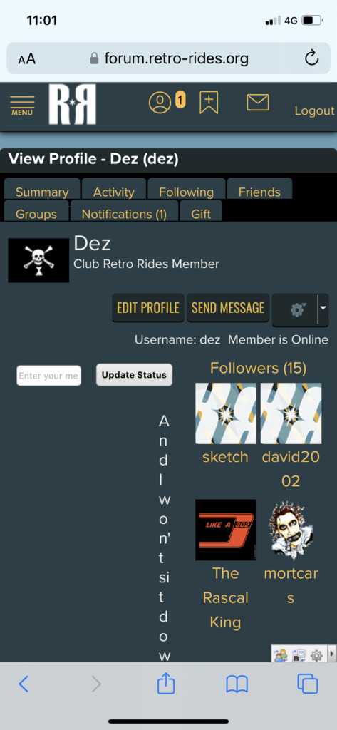 |
| |
|
|
Dez
Club Retro Rides Member
And I won't sit down. And I won't shut up. And most of all I will not grow up.
Posts: 11,714
Club RR Member Number: 34
|
|
Sept 19, 2023 10:06:23 GMT
|
|
Image uploaded worked A-OK though, that’s the first time I’ve used it and it was seamless.
|
| |
|
|
|
|
|
|
|
Sept 19, 2023 10:06:24 GMT
|
I find the thread post icons are a little large too tbh. The band with the like/reply/etc buttons in. If the reply is short that strip is as deep as the reply is. Just seems a bit clunky/space wasting. It’s also think it isn’t immediately apparent if that band goes with the post above it or below it. On the old layout the white boarder ran out into the side framing so it was a much clearer ‘box’. As it stands now the blue line goes off the edge of the screen but the while stops short which is a bit misleading. Yup understand that, I was looking to move more towards something like this: 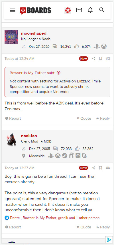 but I ended up spending so long on the editor issues that it changed my timelines. So we're at 'acceptable' at the moment, however we'll be moving towards 'awesome' gradually. I also just noticed on that site when you click the menu button on mobile it doesn't take up the whole width of the screen and makes the screen behind go blurry and that is so swanky I want to do it now very much haha Also the menu is an inspiration for here in terms of nice functions (my posts, new posts etc. etc.) 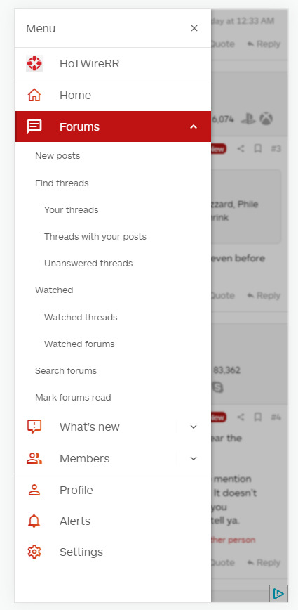 |
| |
|
|
|
|
|
Sept 19, 2023 10:14:36 GMT
|
Another one. The profiles are a bit broken. I clicked on the notification where you just quoted me, and it sent me to my profile but it’s a bit of a mess… Ah balls I knew there was something I'd forgotten to update. Will get to that later today, is just something having a width that it doesn't need at low resolutions. I use the notifications tab as my main point of navigation to participated threads, I don’t know if other people do? So that working right is pretty important to me. I've got a gift for you in the menu system now  |
| |
Last Edit: Sept 19, 2023 10:14:50 GMT by HoTWire
|
|
adam73bgt
Club Retro Rides Member
Posts: 4,868
Club RR Member Number: 58
|
|
Sept 19, 2023 14:51:13 GMT
|
One thing I just noticed, on mobile when I press one of the links to go back up a forum level, this menu appears briefly but I can't select anything from it as pressing the link takes me to the other forum level, so the menu disappears again if that makes sense? 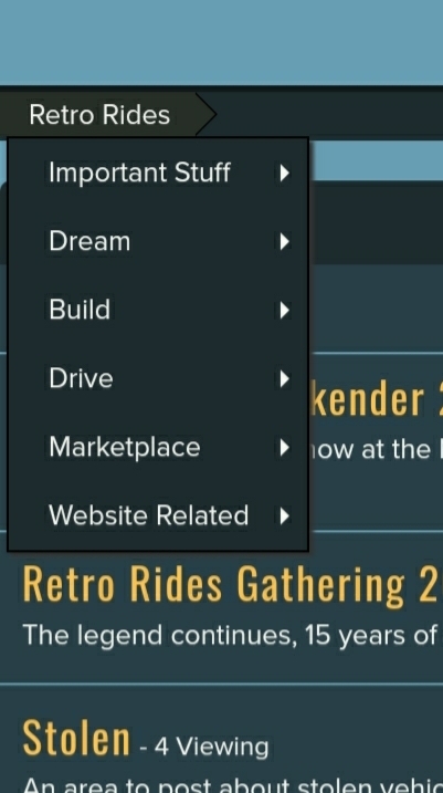 I made the menu stay on by doing a long press on the link but that brings up the Chrome copy/paste/etc. menu which I then have to close down so it's not ideal I can't recall if that menu appears when hovering the cursor over when on PC.. in any case, not saying it's a particular issue, just seemed a bit curious Galaxy S9, Google chrome |
| |
Last Edit: Sept 19, 2023 14:58:28 GMT by adam73bgt
|
|
|
|
|
Sept 19, 2023 15:12:16 GMT
|
I can't recall if that menu appears when hovering the cursor over when on PC.. in any case, not saying it's a particular issue, just seemed a bit curious It is triggered by a click... so on desktop it makes sense with a mouse... for mobile there is no click really, it just appears briefly on the press. Some of that navigation will be moving to the menu system in the future. |
| |
|
|
adam73bgt
Club Retro Rides Member
Posts: 4,868
Club RR Member Number: 58
|
|
Sept 19, 2023 15:34:21 GMT
|
Another thing I've just noticed is that when opening some threads on mobile (in portrait), it doesn't always size exactly to the width of my screen, this thread is fine but if I open this thread for example forum.retro-rides.org/thread/225700/epco-trolley-where-start-rebuild it goes slightly wider than the width of my screen, I assume it's something to do with threads that have photos of a certain width in? Can easily live with it as it takes no time to zoom out to see the full width again but just in case it hadn't been mentioned already 🙂 |
| |
|
|
|
|
|
Sept 19, 2023 16:28:44 GMT
|
it goes slightly wider than the width of my screen, I assume it's something to do with threads that have photos of a certain width in? Yeah looks to be something to do with image sizes, which means it should be fixable. Not sure why it would be a problem with external images and not ours, but it seems to be that way. |
| |
|
|
|
|
|
Sept 19, 2023 17:05:24 GMT
|
My only complaint is that it doesn't tell me which section has new posts on the home screen, so have to go into them all for a nose, other than that I can get used to it |
| |
|
|
|
|
|
Sept 19, 2023 17:18:08 GMT
|
My only complaint is that it doesn't tell me which section has new posts on the home screen, so have to go into them all for a nose, other than that I can get used to it Working on that, just having a bit of a styling nightmare with it. |
| |
|
|
Dez
Club Retro Rides Member
And I won't sit down. And I won't shut up. And most of all I will not grow up.
Posts: 11,714
Club RR Member Number: 34
|
|
Sept 21, 2023 20:26:35 GMT
|
Something I’ve only just noticed that is a really good upgrade- 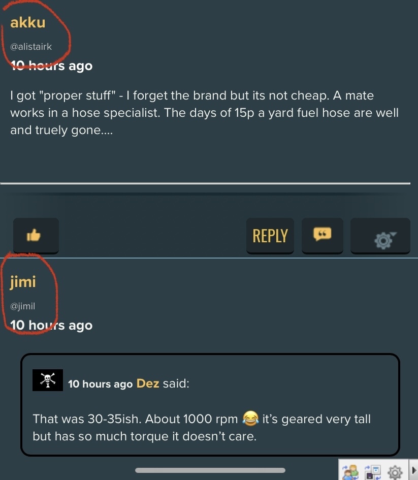 The @ *whoever* below username, very handy for directing replies at people who have tweaked their display name from what they registered as, so if you @ them it doesn’t work. I like that. |
| |
|
|


