|
|
|
|
|
|
Working with a new ad supplier, going to take a week or so to learn what is working what isn't both from our and their point of view.
I know there is a lot of change going on right now, but hopefully by the time we get out the other side of all this we're set for the next 7-8 years (which is when we last did all this).
|
| |
|
|
|
|
|
|
|
|
|
|
|
|
Looking forward to a happy middle road where the ads are not too much of an intrusion and affects footfall, I certainly have left forums years ago because the ads were that intrusive.
At the same time, I guess it is a fine balance between revenue and keeping footfall constant.
|
| |
|
|
bricol
Part of things

Posts: 285 
|
|
|
|
|
If I'm looking at work, all I get is a message where I assume an ad should be, saying this is unavailable under our policy, red letters in a grey box - which is good for me, but probably not what the ad provider is looking for
|
| |
Last Edit: Oct 4, 2023 8:04:55 GMT by bricol
|
|
jimi
Club Retro Rides Member
Posts: 1,822
|
|
|
|
Alternatively for as little as a measly 2.7p per day and the satisfaction of helping to keep RR going you can have linky  😎 |
| |
Last Edit: Oct 6, 2023 6:50:55 GMT by jimi
Black is not a colour ! .... Its the absence of colour
|
|
|
|
|
|
|
Looking forward to a happy middle road where the ads are not too much of an intrusion and affects footfall, I certainly have left forums years ago because the ads were that intrusive. At the same time, I guess it is a fine balance between revenue and keeping footfall constant. Pretty much spot on, it is a fine (and difficult) balance. I'm taking pointers from some very successful forums that seem to have a good balance. My kind of "North Star" is the IGN forum: www.ignboards.com/ I've got a fair way to go to match it, but each step is in the correct direction now, even if at times like this where we're moving between things it may not feel like it. Ironically if we had more income I could afford to pay people to help, but we don't so it falls to me and my limited amount of time and resources. Luckily the people I'm working with on the revised ad stuff have been great so far, I have faith we'll get to that middle ground we need to get to. We're less than 24 hours in at the moment though so it may feel a bit shakey for a little while yet. One thing I'll never do is the whole site take over ads, I use a festival forum/website and it has truly obnoxious levels of ads, and that is also a key pointer site for what to avoid. |
| |
|
|
|
|
|
|
|
|
Get the "Sold out" stuff back in stock.
That would help???
I mean with the filthy lucre end of things.
I've been needing a new RR tee but I've kinda been hanging on for the colouring books.
|
| |
|
|
79cord
Posted a lot
Posts: 2,608
|
|
|
|
|
Just so long as we can avoid the distracting video ads the bring everything else to a stop & or take up half the screen...
Oops. Just saw one... short & small at least...
|
| |
|
|
|
|
|
|
|
Indeed. The video ads are distracting as well for me. I will say that the way it is playing right now, I have no doubt some will walk away. On YouTube (and sometimes FB) where I have a channel, I actually click out of a load of “easy watching” stuff when the ads pop up. I gain more by walking away than waiting for something to play. And not one of the ads sell me anything. We programme our minds to exclude the content, sound of the ads from our direct consciousness It is what humans do. This fixed lower banner and the in page ad are also distracting (not selling, just an irritation to the eye. Once again……. That fine line HotWire and the advertisers have to walk.I do hope these comments are seen as helpful, rather than just moaning HoTWire 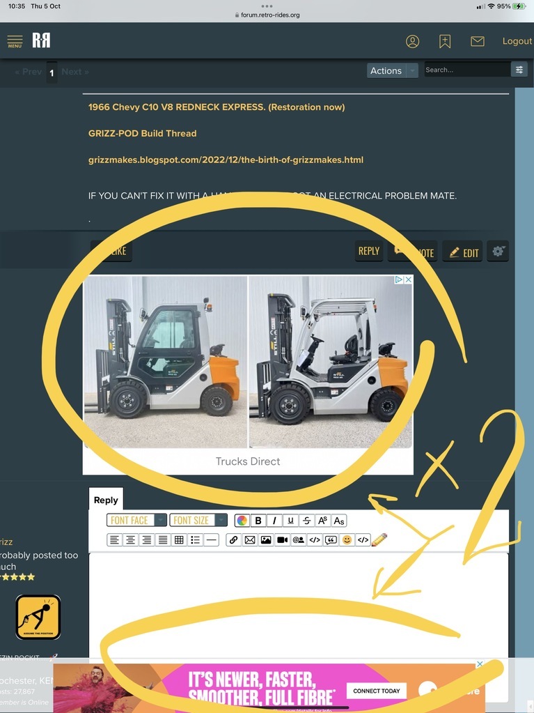 |
| |
Last Edit: Oct 5, 2023 9:39:53 GMT by grizz
|
|
|
|
|
|
|
PS: I think it has been mentioned but to get back to the Home Screen, you need to click twice as the first click gives a drop down menu which the Home Screen in effect gives as well. I find that frustrating as well. FWIW. 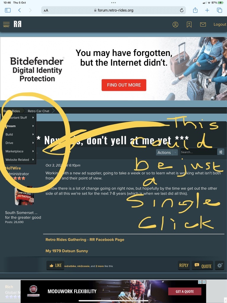 |
| |
Last Edit: Oct 5, 2023 9:58:36 GMT by grizz
|
|
jimi
Club Retro Rides Member
Posts: 1,822
|
|
|
|
Try clicking the RR logo  |
| |
Black is not a colour ! .... Its the absence of colour
|
|
|
|
|
|
|
PS: I think it has been mentioned but to get back to the Home Screen, you need to click twice as the first click gives a drop down menu which the Home Screen in effect gives as well. I find that frustrating as well. RR Logo in the top left takes you to the top level, as does clicking FORUM in the left hand/main menu. You've identified something that I do want to get moved in to the main menu/navigation though. The eagle eyed may have noticed that I've massaged the top menu a bit, will be looking at the side menu too in the not too distant future. Last night I tried to get the likes/quote/reply bar thing a bit neater, but fell foul of some limitations on mobile, so I'm still working on that. I did increase the size of the paging links and solve the problem where you can misclick into your own profile or the top navigation on mobile. Still not got the paging working as it should, spent some time yesterday trying to fathom it out and still can't. I'd love to not be running the sticky bottom ad on mobile sizes, or run it but not the other ads on mobile. I think it'll be there for at least a week as I suspect the ad providers will want a full week of data from it before we decide what is working and what we can change/replace/improve. |
| |
|
|
|
|
|
|
|
|
I saw the widened top margins for the “misclicking” and it is better,,thank,you.
|
| |
|
|
|
|
|
|
|
|
Insomnia sucks.
Woke at 2.20am
Still up, downstairs surfing the web after Messenger would not let me hear Dennis on a chat.
BUT
But the absence of those wide banner video ads on here is noticeable.
Feels much nicer than all the visual distractions of the other ads that made the screen jump about etc.
|
| |
|
|


 😎
😎
