|
|
|
Aug 26, 2023 17:06:33 GMT
|
|
That's the old mobile view. That isn't altered in the slightest by the new layout stuff. Like I literally can't alter it at all (which is the root cause of all the issues I'm trying to solve ironically enough).
|
| |
|
|
|
|
jimi
Club Retro Rides Member
Posts: 1,823 
|
|
Aug 26, 2023 17:12:56 GMT
|
|
According to my profile/ settings I was on the 2023 version
|
| |
Last Edit: Aug 26, 2023 17:13:19 GMT by jimi
Black is not a colour ! .... Its the absence of colour
|
|
|
|
|
Aug 26, 2023 17:22:25 GMT
|
|
Yup, but that is the mobile view. If you go to the bottom you get the option to view the Desktop view. (Which still needs work)
|
| |
|
|
paul99
Part of things

Posts: 410
|
|
Aug 26, 2023 17:44:37 GMT
|
|
Looking better, but when i scroll to the top it springs back slightly, the top line (Retro Rides > Retro Car Chat ) gets hidden behind the RR/Login strip.
Using Chrome on a Macbook Ventura 13.5
|
| |
Last Edit: Aug 26, 2023 17:45:45 GMT by paul99
|
|
|
|
|
Aug 26, 2023 17:47:11 GMT
|
May be just me but on my iPhone I tried to update my thread but started with a quote. For some reason only the quote will upload once I hit the create button and not my text and photos. Also the tool bar with the paper clip stays at the top so you have to scroll up to the top to add a photo and scroll back down to add more text Any idea with this issue @hotwire |
| |
Last Edit: Aug 26, 2023 17:48:37 GMT by jonsey
|
|
paul99
Part of things
Posts: 410
|
|
Aug 26, 2023 17:49:00 GMT
|
Not showing the edit to the post I just made...... Saying 'thanks admin'  |
| |
|
|
jimi
Club Retro Rides Member
Posts: 1,823
|
|
Aug 26, 2023 17:50:41 GMT
|
Ahhh I though there was a new mobile view, didn';t realise it was using desktop at the bottom. [*]This is on a Lenovo 8"; tablet (landscape 1280x800) running Chrome top view
bottom view
|
| |
Last Edit: Aug 26, 2023 18:59:15 GMT by jimi
Black is not a colour ! .... Its the absence of colour
|
|
jimi
Club Retro Rides Member
Posts: 1,823
|
|
Aug 26, 2023 17:52:56 GMT
|
|
I didn't add the [*] around the text I wrote.
When you edit a post the editor is adding random ;
In the top picture the Important Stuff is partially obscured by the RR banner
|
| |
Last Edit: Aug 26, 2023 17:57:23 GMT by jimi
Black is not a colour ! .... Its the absence of colour
|
|
|
|
|
Aug 26, 2023 18:14:22 GMT
|
[/img] 2 hours ago jonsey said: May be just me but on my iPhone I tried to update my thread but started with a quote. For some reason only the quote will upload once I hit the create button and not my text and photos. Also the tool bar with the paper clip stays at the top so you have to scroll up to the top to add a photo and scroll back down to add more text Any idea with this issue @hotwire[/quote] I'll have a look at that tomorrow. And this top banner issue. jimi are you running as block? Whilst I'd rather people didn't, I understand why people do. Would help me resolve the issue if I know though. I'll go through the font sizing stuff as well, might see if I can make a smaller version of the side menu (maybe icons based?) for lower resolutions. I realised whilst driving to a friend's house this evening that some of the other stuff that changes between screen size changes will need to be updated too (I missed them earlier because the styling has got quite complex now !!) Biggest gripe (outside of the general resistance to change and giving me the chance to correct errors I was unaware of) is the quote and edit stuff. Which is essentially the same bit of code. So I'll run up some more test for that and work out what is going on. |
| |
|
|
|
|
|
Aug 26, 2023 18:52:19 GMT
|
|
Also edit used to be working so I've broken that recently. And the weird thing when images are breaking quotes used to not be a problem.
|
| |
|
|
|
|
jimi
Club Retro Rides Member
Posts: 1,823
|
|
Aug 26, 2023 18:53:23 GMT
|
|
No, not on my tablet, I don';t run an ad blocker and I have Chrome';s internal pop up/intrusive ad blocker turned off.
Does the new editor not have a preview option ? or smilies ?
Resistance to change is a common cross web masters have to carry, a little bit of patience from users can go a long way. Keep at it, you';ll get there, not an easy job especially if your doing it all yourself, even extensive beta testing doesn';t find all the problems, live sites usually do 😉
|
| |
Last Edit: Aug 26, 2023 18:57:25 GMT by jimi
Black is not a colour ! .... Its the absence of colour
|
|
|
|
|
Aug 26, 2023 20:10:01 GMT
|
|
Now can’t post pics anymore on my I phone
Used this for years with no problems, why change things?….if it ain’t broke
|
| |
Fraud owners club member
1999 Jaguar s type
1993 ford escort
|
|
Darkspeed
Club Retro Rides Member
Posts: 4,702
Club RR Member Number: 39
|
|
Aug 26, 2023 20:21:52 GMT
|
|
Just tried to make an edit in a post and as other have found I had random semi colons added that I had to go back and delete. A little annoying.
The missing "ad picture etc" block is a bit strange and now using the paperclip that immediately fills your working space with the picture rather than the code makes it hard work. I used to like the full editor function that I cannot find now. And the two option of preview and BB?
Find the signature font being bigger than the post font odd
Had to use the settings to go back to the old version as this has actually made it far more difficult to post for me.
Going from top right to left for menus - not a fan seems like a change for change sake - font width and contrast makes it hard to read.
See how it goes but at this moment it time - for me personally - it does not appear to be an improvement.
Chrome/Windows 10
|
| |
|
|
jimi
Club Retro Rides Member
Posts: 1,823
|
|
Aug 26, 2023 20:47:09 GMT
|
|
It has to be done, he just needs some time to sort bits out.
|
| |
Last Edit: Aug 26, 2023 20:50:54 GMT by jimi
Black is not a colour ! .... Its the absence of colour
|
|
|
|
|
Aug 26, 2023 21:18:29 GMT
|
Windows 10 and Chrome version 116.0.5845.111 on my work laptop. I'm about to be critical but I'll try to be as objective as possible so hold on... This is my browser view on the 1920x1080 laptop screen:  It's a lot of blue space on both sides which means the bit I'm trying to read in the middle is too small. It needs to grow as a percentage with a bigger browser window IMO, not fixed width. With a smaller window size, the menu bar on the left stays the same size which pushes the content off to the right and my page becomes lopsided to the right. My opinion of the menu on the left is it ought to be at the top and scroll out of of view. It doesn't need to be permanently on the left - it's not something I normally use and I don't want to see it all the time. This is my reply view:  This is too small. It needs to pop into a bigger window when I click in it for me to work in, like it did before in the old advanced view. In the reply I'm currently typing, I can see the window growing as I type, but I have to keep scrolling to the top if I want to check formatting, add another image etc. It would be better if the reply window was a fixed height with a scroll bar. If this was a post with a lot of images, it would be a lot of scrolling to get to the top each time. I quite liked having the add image button directly underneath at the bottom. I could do with a plain text / bbcode mode. I'm oldschool and write most of my threads and posts like this so that the forum formatting doesn't add too many s or random formatting where I don't want them. This is a major moan from a lot of users on autoshite where the forum software they're using doesn't actually allow a plain text version. Users posts look an absolute mess when they've been copying and pasting text. Final couple are probably glitches. Pressing Page Up / Page Down in the reply window scrolls the whole window page up or page down. I'd like to see it just scroll the reply if I'm in a reply. Also, in the reply window the cursor is permanently a pointy finger. The vertical line thing when you're working or hovering over text makes it easier to position over text etc. |
| |
Last Edit: Aug 26, 2023 21:38:32 GMT by Jonny69
|
|
|
|
|
Aug 26, 2023 21:26:33 GMT
|
|
I can see it has actually parsed and recognised some code. Hitting Edit, it's showing a lot of random semicolons that I didn't put in and has added double
where I hit <return> twice.
|
| |
Last Edit: Aug 26, 2023 21:39:16 GMT by Jonny69
|
|
|
|
|
Aug 26, 2023 21:45:39 GMT
|
I'm just going to put this here so Jonny69 and others can see the difference in space given to the thread in the old and new versions of the site, and what impact the left hand menu has on that space. 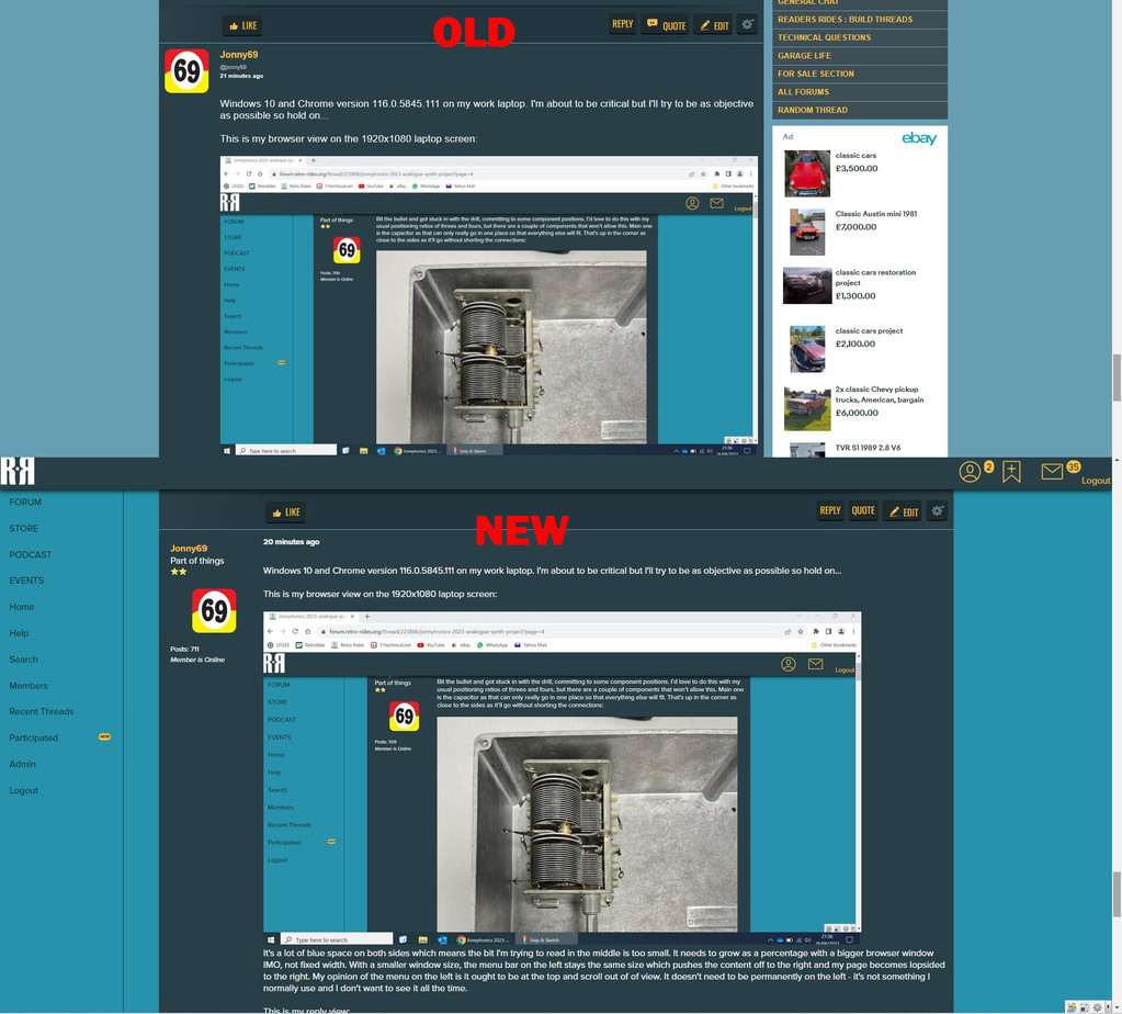 |
| |
|
|
|
|
|
Aug 26, 2023 21:53:57 GMT
|
|
Think I found the problem with the semi colons.
Will see if I can locate the double return issue.
Will also get a raw code view sorted, as I need that anyway to debug things, However I doubt the image upload will be added to that any time in the next week.
Just think I'll do a "bit" of 'testing' to make sure it is fix'ded
|
| |
Last Edit: Aug 26, 2023 21:55:41 GMT by HoTWire
|
|
|
|
|
Aug 26, 2023 22:14:22 GMT
|
|
I have a plan, that needs a bit of thinking, I'm going to have the show/hide menu for all resolutions of the site. When you click hide it will store the state of the menu in your localstorage on your browser, meaning it will carry over from page to page. It won't affect the width of the content area, but it will mean you can remove the visual distraction of the menu being there on desktop if you wish.
This is something Ignboards do, but hadn't noticed they did, it is where I've taken a lot of the inspiration for this layout from, seeing as they are the most popular and well funded forum on the planet, so it seems reasonable to utilise the effort they've put in. Obviously I've got a fair way to go to get it to their level of clarity, however I think once I move past these initial hurdles and people understand the forum now focusses more on the content of a thread than it did before, despite what they think may be happening, it puts us on a road to improvement. This isn't my end point, I have plans, I want to be able to save drafts of threads/posts/replies, I want to automatically upload images from pasted links, I want to be able to upload video eventually, I need a unified mobile experience, and I've just discovered a new bug with the height of the text box, now that I've fixed it... so I'll go and fix that and then I'm going to sleep.
|
| |
|
|
jpsmit
Posted a lot
Posts: 1,256
|
|
Aug 26, 2023 23:22:24 GMT
|
|
What I really like is that you click on the time of the last post and takes you right to it. awesome!
What I don't like is that having gone to the end of the post it doesn't seem to immediately be marked as read (bold to italic) - and just now I was looking at a post that I had looked at a few hours ago and it still hadn't moved to 'read' (and nothing has been added)
What I also liked about the old version is that the page numbers floated so I didn't have to scroll all the way to the top or the bottom to see what page I am on.
Certainly a clear(er) text and I both appreciate the whole forum and your willingness to try something new (which is why I like the whole forum because so many members in their restorations/ customizations try something new)
Keep up the good work!
|
| |
|
|
|
|


