|
|
|
|
|
|
Putting this in here because I'm guessing people will jump in here to talk about it:
Okay I know you probably hate it already, but give it a little bit of time to bed in and let me do some more of the tweaks I have planned for it. I 100% guarantee it will be a better overall experience than the previous version of this theme.
Constructive observations gratefully received. Particularly if they have browser, device and/or screen size with them (screen shots also gratefully received).
If you are feeling adventurous on mobile the "desktop" view is now much more mobile friendly, and ultimately I plan to make it the main/only way to view on mobile (little way to go yet with that).
|
| |
|
|
|
|
|
|
|
|
|
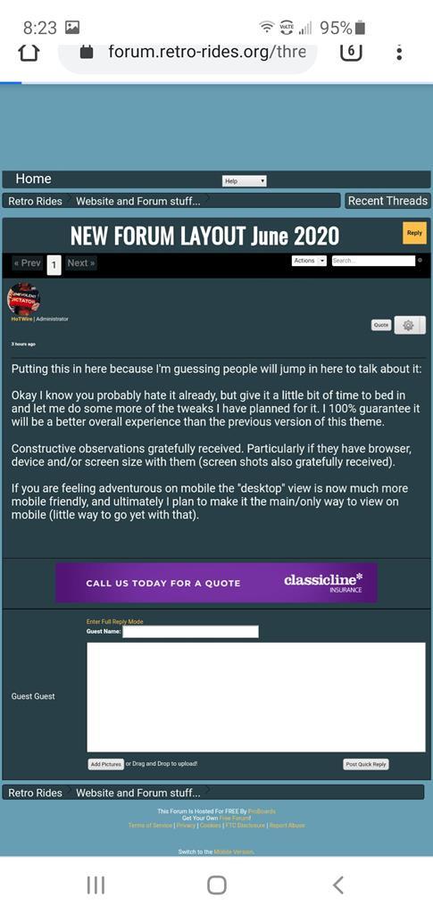
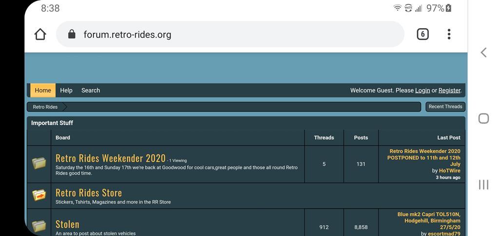
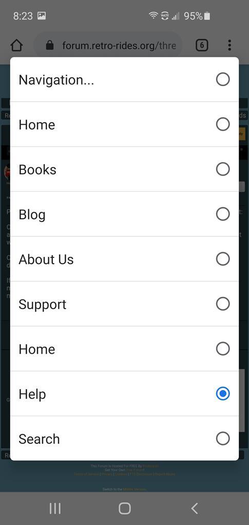
A few problems. 1) Chrome mobile - the page is too wide to fit the login at the top unless the phone is rotated horizontally. (Screen 2280x1080).  ...and with the phone sideways:  Even set to WQHD+ (3040x1440) it doesn't fit. Once logged in, it all works fine. 2) "Home" appears twice on the "Navigation" popup  3) Windows 7, 1280x1024 screen the home page doesn't fit horizontally and has a scrollbar. Possibly same issue with the desktop version of Chrome where the resolution is "narrow". Thank you for taking the time to try and bring things up to speed though. --Phil |
| |
Last Edit: Jun 2, 2020 13:42:18 GMT by PhilA
|
|
|
|
|
|
|
Windows 7, 1280x1024 screen the home page doesn't fit horizontally and has a scrollbar. Possibly same issue with the desktop version of Chrome where the resolution is "narrow". Thanks for that Phil, I'll have a look at the width stuff, there are a series of breakpoints where it hides and shows different elements based on screenwidth, there is a weird hinterland between "full size" on desktop and tablet sized screens where I don't have breakpoints. Will work on those. The mobile top menu stuff is handy too to see from a non-admin users point of view. That was the most recent thing I re-jigged and it isn't right, I'm going to look at a better way of structuring that. |
| |
|
|
scimjim
Club Retro Rides Member
Posts: 1,503
Club RR Member Number: 8
|
NEW FORUM LAYOUT June 2020scimjim
@scimjim
Club Retro Rides Member 8
|
|
|
|
Been using it on the iPad since you launched the beta - and I think it’s great!
|
| |
|
|
|
|
|
|
|
|
The text is to big on my iPad using safari, i miss the desktop version of retrorides.
|
| |
|
|
vulgalour
Club Retro Rides Member
Posts: 7,284
Club RR Member Number: 146
|
NEW FORUM LAYOUT June 2020vulgalour
@vulgalour
Club Retro Rides Member 146
|
|
|
|
Apart from the Like button being on the left throwing me at first (used to it now, bit like getting in a car with the indicator stalk on the unexpected side), the new Like, Quote, etc. buttons are a welcome improvement. Likewise the rounded corner avatars look much better with the majority of avatars than the plain circle did. No complaints.
|
| |
|
|
mk2cossie
Club Retro Rides Member
Posts: 3,060  Club RR Member Number: 77
|
NEW FORUM LAYOUT June 2020mk2cossie
@mk2cossie
Club Retro Rides Member 77
|
Oct 19, 2020 19:10:44 GMT
|
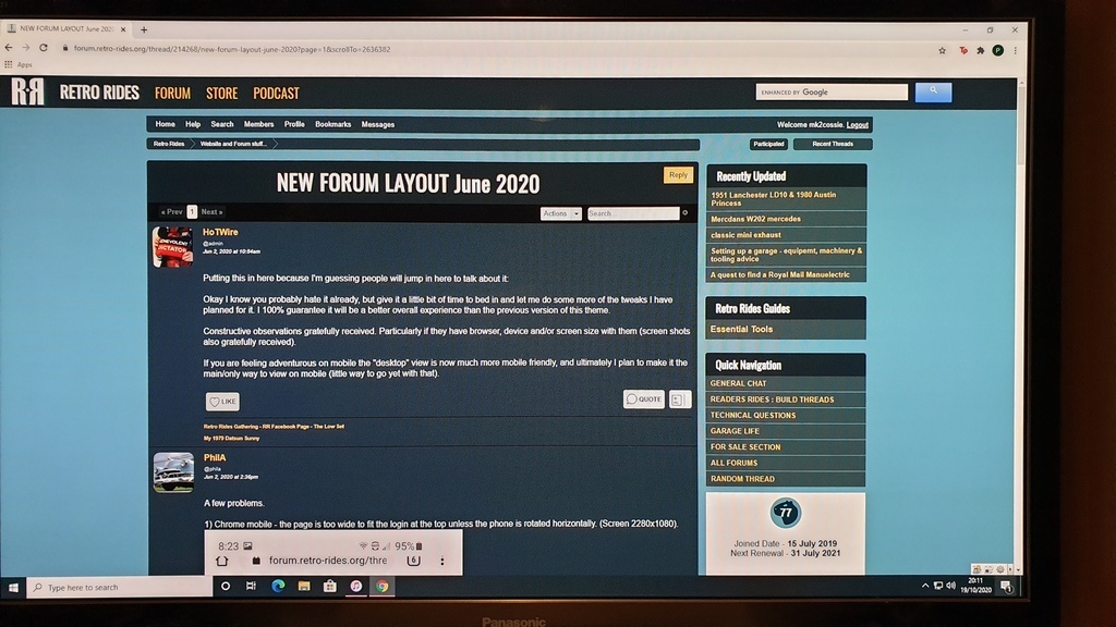
Is it just me that gets a weird gap on either side of the main central bar? The rounded corner avatars are a nice touch though  (HP mini PC running Windows10 on Google Chrome if that helps HoTWire) |
| |
|
|
|
|
|
Oct 19, 2020 19:46:55 GMT
|
Is it just me that gets a weird gap on either side of the main central bar? The rounded corner avatars are a nice touch though  (HP mini PC running Windows10 on Google Chrome if that helps HoTWire) Would love a screen shot. I did some fiddling with some bits earlier hope I haven't broken something |
| |
|
|
mk2cossie
Club Retro Rides Member
Posts: 3,060  Club RR Member Number: 77
|
NEW FORUM LAYOUT June 2020mk2cossie
@mk2cossie
Club Retro Rides Member 77
|
Oct 19, 2020 20:35:45 GMT
|
It is an actual screenshot taken and posted from my phone tho   |
| |
|
|
autojumbled
Club Retro Rides Member
Posts: 226
Club RR Member Number: 106
|
NEW FORUM LAYOUT June 2020autojumbled
@autojumbled
Club Retro Rides Member 106
|
Oct 20, 2020 10:21:47 GMT
|
It is an actual screenshot taken and posted from my phone tho   That looks fine? |
| |
|
|
|
|
Frankenhealey
Club Retro Rides Member
And I looked, and behold, a pale horse! And its rider's name was Death
Posts: 3,881
Club RR Member Number: 15
|
NEW FORUM LAYOUT June 2020Frankenhealey
@frankenhealey
Club Retro Rides Member 15
|
Oct 20, 2020 13:51:29 GMT
|
|
Liking the new and very professional layout - a lot!
|
| |
Tales of the Volcano Lair hereFrankenBug - Vulcan Power hereThe Frankenhealey here |
|
|
|
|
Oct 20, 2020 14:19:03 GMT
|
Liking the new and very professional layout - a lot! You can thank Littlepixel for that, cleaning up and tightening up a bunch of stuff. More to come hopefully  |
| |
|
|
Frankenhealey
Club Retro Rides Member
And I looked, and behold, a pale horse! And its rider's name was Death
Posts: 3,881
Club RR Member Number: 15
|
NEW FORUM LAYOUT June 2020Frankenhealey
@frankenhealey
Club Retro Rides Member 15
|
Oct 20, 2020 15:05:59 GMT
|
Liking the new and very professional layout - a lot! You can thank Littlepixel for that, cleaning up and tightening up a bunch of stuff. More to come hopefully  He is a graphics god! |
| |
Tales of the Volcano Lair hereFrankenBug - Vulcan Power hereThe Frankenhealey here |
|
meltdown
South West
Isn't letting old age get the better of him, still making the same bad decisions with vehicles.
Posts: 687
|
|
Oct 26, 2020 11:58:15 GMT
|
Hi All I’m using an iPhone with latest update.and not used desktop view on this since the July improvement. Not sure what has happened but I can’t see an option to login! Cheers ![]() [/img] |
| |
Last Edit: Oct 26, 2020 12:06:15 GMT by HoTWire
Powered by biscuits
|
|
|
|
|
Oct 26, 2020 12:05:42 GMT
|
Hi All I’m using an iPhone with latest update.and not used desktop view on this since the July improvement. Not sure what has happened but I can’t see an option to login! Should be this link to log in: login.proboards.com/login/2095273/1Although you are logged in when you posted that? Not sure why your image didn't want to work  |
| |
|
|
meltdown
South West
Isn't letting old age get the better of him, still making the same bad decisions with vehicles.
Posts: 687
|
|
Oct 26, 2020 12:06:31 GMT
|
|
Reply button looks to be crowding the second upload image icon
|
| |
Powered by biscuits
|
|
meltdown
South West
Isn't letting old age get the better of him, still making the same bad decisions with vehicles.
Posts: 687
|
|
Oct 26, 2020 12:08:03 GMT
|
|
I logged in via mobile and then requested desktop to get around the “issue” 😁
so it looks like my issue is down to an Old bookmark Hotwire?
|
| |
Last Edit: Oct 26, 2020 12:12:21 GMT by meltdown
Powered by biscuits
|
|
mk2cossie
Club Retro Rides Member
Posts: 3,060  Club RR Member Number: 77
|
NEW FORUM LAYOUT June 2020mk2cossie
@mk2cossie
Club Retro Rides Member 77
|
Oct 26, 2020 20:49:14 GMT
|
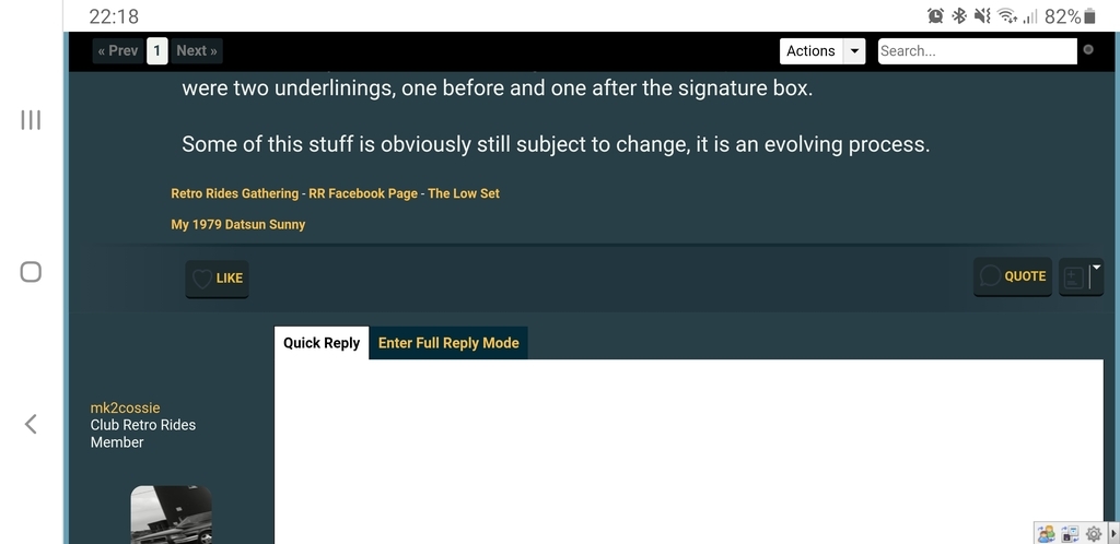
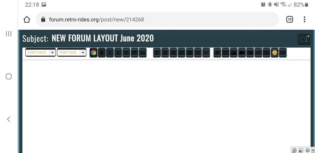
And its all changed again  Not sure about the underlining all the way across the bottom of a post, or the layout when replying now  |
| |
|
|
|
|
|
Oct 26, 2020 21:35:28 GMT
|
And its all changed again  Not sure about the underlining all the way across the bottom of a post, or the layout when replying now  We're still only part way through stuff, it'll be more complete soon. When you are replying are you using the quick reply or the full reply view? Can you screen shot it for me, just want to make sure it is looking how I expect it to. There has always been an underlining at the bottom of a post, it used to be black, in fact there were two underlinings, one before and one after the signature box. Some of this stuff is obviously still subject to change, it is an evolving process. |
| |
|
|
mk2cossie
Club Retro Rides Member
Posts: 3,060  Club RR Member Number: 77
|
NEW FORUM LAYOUT June 2020mk2cossie
@mk2cossie
Club Retro Rides Member 77
|
Oct 26, 2020 22:22:43 GMT
|
Screenshot from my phone i can do  although having done that, the colours of the boxes in the reply option don't seem to work well, or are possibly blanked out  And I hardly ever use the quick reply option, and never use the mobile version on my phone (Galaxy Note9 and on Chrome)  |
| |
|
|
|
|


