|
|
|
May 28, 2020 11:01:54 GMT
|
Hello folks, I've been beavering away in the background with an update for the RR theme, it is actually a starting point for future improvements, I needed first to simplify the theme the site runs a lot (it has been evolving over the last ten years or so and was stuck together with bits of gaffer tape and nails). This isn't the final form of it, not by a long shot, but I'm trying to have one theme that will work on desktop, tablet and mobile. I've been running it as my normal view for the last week or so (using the "desktop" mode on my phone as well). I could do with a wider test though, so if anyone wants to have a look you can  Head to Profile in the menu up there ^^^ then click Edit Profile > Settings Tab > Forum Theme Dropdown then select Updated RR Theme The main thing you'll probably notice on desktop is the right hand rail is now consistent across the site, without losing width on the content (in fact it is now slightly bigger), I've also increased the font size for readability. I still need to run through and ensure there is spacing on some pages (private messages for example) and remove the right rail on some pages (thread creation for example), however I want to make sure this is all working before I go and do those things, or if I need to reformat the whole thing a different way. Would love a report from tablet users on how it is for you, I did the screen sizes to remove some elements and change font sizes depending on platform screen size, but I don't own a tablet to test with directly (just developer tools). If this all works I hope to be able to share a roadmap of where I'm going with all this at some point soon  |
| |
|
|
|
|
scimjim
Club Retro Rides Member
Posts: 1,503
Club RR Member Number: 8
|
|
May 28, 2020 16:36:02 GMT
|
It’s definitely narrower on an iPad with the recently updated box on every page. 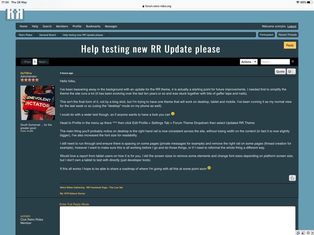  |
| |
|
|
MiataMark
Club Retro Rides Member
Posts: 2,961
Club RR Member Number: 29
|
|
May 28, 2020 16:36:14 GMT
|
I get a big gap on the first page, as below, I think you might have gone overboard with the font size as well.  This is Firefox on a MacBook |
| |
1990 Mazda MX-52012 BMW 118i (170bhp) - white appliance 2011 Land Rover Freelander 2 TD4 2003 Land Rover Discovery II TD52007 Alfa Romeo 159 Sportwagon JTDm
|
|
scimjim
Club Retro Rides Member
Posts: 1,503
Club RR Member Number: 8
|
|
May 28, 2020 16:37:04 GMT
|
|
I like the increased font size though 😀
|
| |
|
|
scimjim
Club Retro Rides Member
Posts: 1,503
Club RR Member Number: 8
|
|
May 28, 2020 16:38:23 GMT
|
I get a big gap on the first page, as below, I think you might have gone overboard with the font size as well. This is Firefox on a MacBook That gap is an advert on my iPad.  |
| |
|
|
MiataMark
Club Retro Rides Member
Posts: 2,961
Club RR Member Number: 29
|
|
May 28, 2020 16:39:22 GMT
|
I like the increased font size though 😀 I guess that depends on what your displaying it on, I'm viewing on a 22" monitor. It does look quite nice on the MacBook 13" screen. |
| |
1990 Mazda MX-52012 BMW 118i (170bhp) - white appliance 2011 Land Rover Freelander 2 TD4 2003 Land Rover Discovery II TD52007 Alfa Romeo 159 Sportwagon JTDm
|
|
scimjim
Club Retro Rides Member
Posts: 1,503
Club RR Member Number: 8
|
|
May 28, 2020 16:42:11 GMT
|
|
And how old you are 😂
|
| |
|
|
MiataMark
Club Retro Rides Member
Posts: 2,961
Club RR Member Number: 29
|
|
May 28, 2020 16:44:42 GMT
|
Old enough to have learnt to drive in a BSM MK1 Escort... |
| |
1990 Mazda MX-52012 BMW 118i (170bhp) - white appliance 2011 Land Rover Freelander 2 TD4 2003 Land Rover Discovery II TD52007 Alfa Romeo 159 Sportwagon JTDm
|
|
duncanmartin
Club Retro Rides Member
Out of retro ownership
Posts: 1,320
Club RR Member Number: 70
|
|
May 28, 2020 17:04:21 GMT
|
Font size is much bigger, which is fine, but there's a quite a lot of unused real-estate (24" monitor, Chrome, Windows). And it's worse once you get a bit further down the page and the Recently Updated thing goes away. 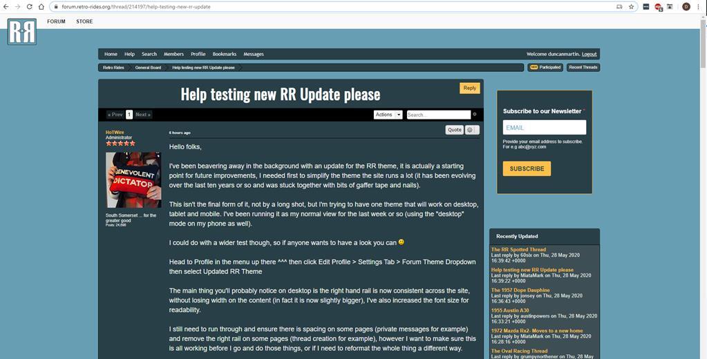 Also, when editing the post, the Recently Updated box is right up against the edge of the content boxes. 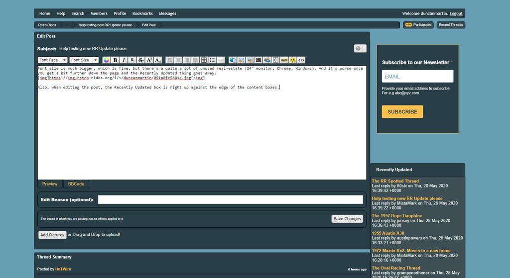 |
| |
|
|
|
|
|
May 28, 2020 17:24:11 GMT
|
|
On Chrome, as he said there is a lot of blue edging......
And of course piccys are now a LOT smaller.
Merely observations Mr HotWire sir...
On my mobile, on Chrome its way better. Much easier to read also.
|
| |
|
|
|
|
|
|
|
May 28, 2020 20:58:47 GMT
|
|
Thanks for the feedback so far. I've got a bunch of time tomorrow earmarked for working more on this, so should fix some of the bugbears.
Google has flipped over to autoplaced ads again (the last experiment it was running expired) which is why there are more ads than normal in the front page (and the big gap where they aren't loaded. Will sort that out too!
|
| |
|
|
|
|
|
May 28, 2020 21:39:45 GMT
|
|
Looks much nicer overall HW but I get a horizontal scroll bar on Chomium @ 1280x1024 and the sidebar is partially off the RHS of the screen. Could you dial the font size back a little maybe?
|
| |
|
|
|
|
|
May 28, 2020 22:31:59 GMT
|
Doesn't fit on the screen any more unless I've missed something. Need to run the zoom at 90% on my 13" MacBook to see it all - but that does reduce the font size nicely as it's a bit large for my taste.  |
| |
Last Edit: May 28, 2020 22:34:54 GMT by rallyboy
|
|
|
|
|
May 29, 2020 11:02:49 GMT
|
Just to warn everyone I'm starting fiddling again now, so if you are running this theme at the moment you may have some eccentricities thrown up as I work through issues |
| |
|
|
|
|
|
May 29, 2020 13:12:19 GMT
|
It’s definitely narrower on an iPad with the recently updated box on every page. Tablet display should now not have the right hand column on every display. You will soon have some extra ads in the middle of threads, but that isn't going to be an issue for Club Members  I get a big gap on the first page, as below, I think you might have gone overboard with the font size as well. Turns out that was because I accidently set the tablet advert structure on every screen resolution DoH! (can't blame Google for that) Font size is much bigger, which is fine, but there's a quite a lot of unused real-estate (24" monitor, Chrome, Windows). And it's worse once you get a bit further down the page and the Recently Updated thing goes away. That is always going to be the case with a display that has a contained width. Facebook's central column is 500px wide, they load up the surrounding content. What they do though is halt the scrolling on the right hand column as you scroll down, that is one of my plans. I just need to actually get the content of the right hand column a bit better sorted before I do that (some extra navigation and things to go over there). Also lovely lovely club members get an ad free experience so that right column is a little emptier at the moment, however I have some plans for some extra club content over that side (quick links and such). Looks much nicer overall HW but I get a horizontal scroll bar on Chomium @ 1280x1024 and the sidebar is partially off the RHS of the screen. Could you dial the font size back a little maybe? Not been able to reproduce the scroll bar issue, I've been testing with your screensize and made some small alterations, so would be interested to see if anything has changed for you. On Chrome, as he said there is a lot of blue edging...... And of course piccys are now a LOT smaller. I think I messed up my screen size break points for some screen sizes, the idea is that the viewing area is the same for threads, but if you have enough screen real estate you get the right column there. That may need a little more massaging as there is a gap between what is considered "tablet sized" and what is full screen sized for everything to appear. I'll keep improving now that I've got the basics in place. Other things I've done today: Shifted around the Avatar display so the left column is smaller and there is more real estate for content. Moved the thread info so the actual content of a post is nearer the name of the person that posted it. Added spacing on the non-thread pages that display the right hand box Round avatars ... I like them, but your mileage may vary Reduced font size on larger displays a little Things to do: Improve Like's display on threads/posts Sort out sizing on private messages Look at profile displays Additional site navigation on the right hand column More mobile testing (I think some of the button sizing has gone a bit out with the latest updates) Re-do bread crumb display and navigation displayed above forum content Re-do overall RR navigation and unify across Store, Club, Events and Podcast pages Make buttons a bit more attractive overall Fix position of user tagging dialog on thread creation/editing |
| |
Last Edit: May 29, 2020 13:17:35 GMT by HoTWire
|
|
scimjim
Club Retro Rides Member
Posts: 1,503
Club RR Member Number: 8
|
|
May 29, 2020 14:14:32 GMT
|
Like the full width threads now - avatar has gone weird with the resizing and/or round display though? 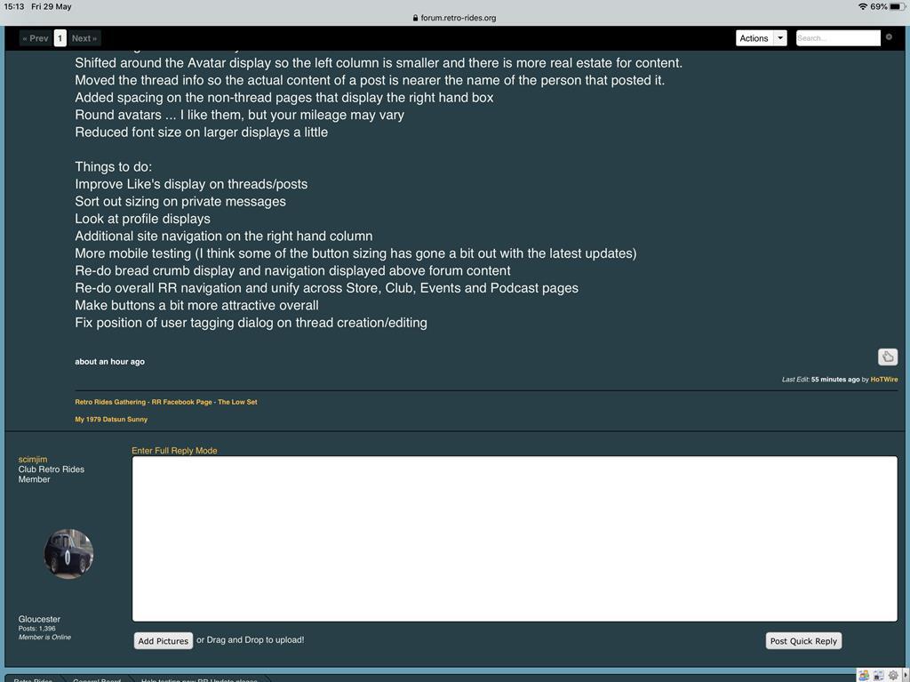 |
| |
|
|
|
|
|
May 29, 2020 14:20:13 GMT
|
Like the full width threads now - avatar has gone weird with the resizing and/or round display though? Non-square avatars are a bit stretched, I'll have a look in to this see if I can round it off, but pad it top and bottom so that it doesn't stretch, however it'll have to wait a little while as I'm still deciding if I like the look |
| |
|
|
|
|
|
May 30, 2020 14:36:54 GMT
|
I've changed the heading on mobile now, so that should be a bit less scrunched and I've removed the last breadcrumb as it didn't make any sense to have a link to the thread you were currently in. Hopefully sort the right hand navigation and improve some of the mobile sizing tomorrow, then I'm going to force this on everyone and await the complaints |
| |
|
|
|
|
|
|
|
|
Sorry to be the bearer of bad news. ....
Regarding the uploading of photos via iPad,everything now works swimmingly.....apart from in private messaging. Click on the usual add pictures box and naught happens 😕
|
| |
|
|
|
|
|
|
|
Sorry to be the bearer of bad news. .... Regarding the uploading of photos via iPad,everything now works swimmingly.....apart from in private messaging. Click on the usual add pictures box and naught happens 😕 Should be able to fix that. Will have a look when I do the updated design stuff in there this week. Once I'm happy with PM's and profiles this lot will go live and then I'll polish up the "desktop" mobile experience. |
| |
|
|
|
|

