glenanderson
Club Retro Rides Member
Posts: 4,089
Club RR Member Number: 64
|
This was the NAUGHTY CORNERglenanderson
@glenanderson
Club Retro Rides Member 64
|
Jun 15, 2019 13:12:07 GMT
|
|
Dear Weird of Hove.
First off, I’d change the waterpump, dodgy header-tank and any other suspect hoses while the rad etc. are off and the system is drained down.
Secondly, I’d sling a dose of rad flush in to the existing soup, and go for a good drive to get things warmed right up and give it a chance to do it’s job. I’d drive around for a week or two with it in there if I could. Then, before taking the radiator out, I’d drop the majority of the coolant out (by undoing the bottom hose), refill with clean water out of the water butt, run it back up to temperature again to circulate and rinse out all the nooks and crannies, and then drop it out. Job done.
You shouldn’t let antifreeze go down a storm drain, or dispose of it anywhere pets are likely to come into contact with it (particularly cats). So letting it just go in a roadside gutter is asking for trouble.
With the system flushed and empty I’d then swap over the new bits for the old, and refill with just rainwater initially to check for leaks. Run the car up to temperature and make sure all is well. Then I’d pop the bottom hose off again, to let it all go, refill with the required amount of fresh antifreeze, top up with rainwater and call it a day.
I’m not sure what the cooling system capacity is on a Scimitar, but I wouldn’t be surprised if it’s not 10 or more litres, so you’d need at least a 5 litre can of antifreeze concentrate.
I appreciate Dover is a long way from Hove, but you’re welcome to come and do it on my driveway. Tea, mickey-taking and spanners are all available.**
**But not if the speedo is wonky.
|
| |
My worst worry about dying is my wife selling my stuff for what I told her it cost...
|
|
|
|
|
|
|
Jun 15, 2019 13:33:55 GMT
|
Do what the simple thing is. Even flushing won't remove everything, so why bother. Most of the crud that draining won't remove is happy to stay where it is, and the worst of it is trapped in the lower and narrower parts of the rad tubes. Once again with the bias against the Irish. For shame @quatermass, for shame. I can't help it Tristan. It's deeply ingrained. It's almost part of the educational system over here. |
| |
|
|
|
|
|
Jun 15, 2019 13:39:01 GMT
|
**But not if the speedo is wonky. I really feel I ought to apologise for this rather disturbing video^ I was trying to drive a car in traffic at the time. Having now viewed it, I think I'd be getting a restraining order out on my self just to be on the safe side. |
| |
Last Edit: Jun 15, 2019 13:42:08 GMT by Deleted
|
|
glenanderson
Club Retro Rides Member
Posts: 4,089
Club RR Member Number: 64
|
This was the NAUGHTY CORNERglenanderson
@glenanderson
Club Retro Rides Member 64
|
Jun 15, 2019 13:42:03 GMT
|
|
That’s it. You’re banned.
|
| |
My worst worry about dying is my wife selling my stuff for what I told her it cost...
|
|
|
|
|
Jun 15, 2019 13:45:51 GMT
|
|
But anyway Dover is indeed a long way from Hove. I do really appreciate the offer but I reckon by the time I eventually arrived - probably on a low loader - the radiator would be item 59 on my revised list of priorities.
I did have the makings of an arrangement with Elkyholic, and he was quite open to the idea. But his wife was expecting their second, and I know from experience that the second baby is more than twice the work of the first. He hasn't been back in since and I really don't want to bother him. So I've never chased him up because it would be exactly like chasing. Equally it's not like he's going to chase me either, so it's kind of a sleeping notion at the moment.
Maybe he'll reappear one day and that will be a way forward. Until then, I'm just going to make a decision about the best way forward and stick to it.
|
| |
Last Edit: Jun 15, 2019 13:52:03 GMT by Deleted
|
|
The Doctor
Club Retro Rides Member
Posts: 3,434
Club RR Member Number: 48
|
This was the NAUGHTY CORNERThe Doctor
@thedoctor
Club Retro Rides Member 48
|
Jun 15, 2019 14:13:02 GMT
|
Dover is about 1/4 of the distance of Goirle - Hove, it's not that bad  |
| |
Last Edit: Jun 15, 2019 14:16:57 GMT by The Doctor
|
|
glenanderson
Club Retro Rides Member
Posts: 4,089
Club RR Member Number: 64
|
This was the NAUGHTY CORNERglenanderson
@glenanderson
Club Retro Rides Member 64
|
Jun 15, 2019 14:17:50 GMT
|
|
Well, the invitation is open, if you change your mind.
Anyway, you’re still banned.
|
| |
My worst worry about dying is my wife selling my stuff for what I told her it cost...
|
|
|
|
|
Jun 15, 2019 17:17:53 GMT
|
It's raining, everyone else is entertaining themselves. Couldn't resist making a start on re-drawing that Ginetta logo, as well as doing some exploratory work on an actual real logo cut I'vebeen asked to think about. Started with a basic drawing of existing letterform. Very easy as it's all straight lines. There are some oddities though. The existing logo gets less skewed towards the end. Also the stroke weights are all identical, which is never a good idea because anything more vertical flies past your eyes and appears thinner, and horizontals stay in your eye movement longer and so appear fatter. I also feel that the logo needs its centre of gravity brought down. I have a personal liking for letters with lower mid-horizontals anyway so this might just be me tweaking it to suit my tastes but I do feel that a sporting car logo ought to have a lower centre of gravity. Firs I did an exact drawing, and then started fiddling. Most notably with the A, just as a rough start 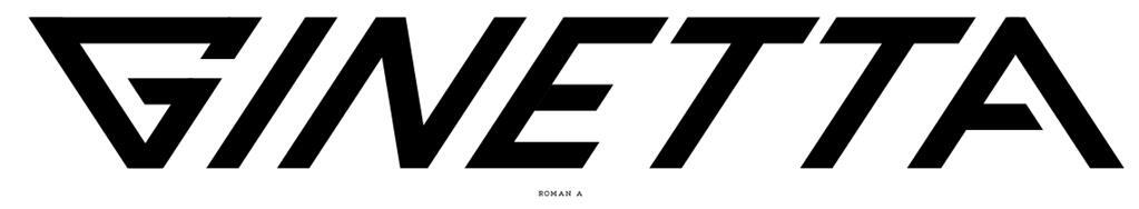 The trouble with that A though is it reflects the angles of the G. So at the end of italicised letters it looks roman (ie not italic) and therefore the right leg visually kicks out like a Flashdance poster pose. So I had to adjust it to look less roman, which isn't just a case of moving the leg because the internal apex changes and the optical stroke weight changes. So this was re-drawn roughly/quickly to see what might work. Not even half sure it's even remotely right yet... 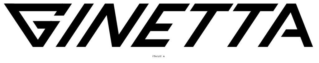 So then I had a fiddle with the logo G because the way it's drawn means the bottom internal apex is cutting in to the meat of the strokes. Also, the lowering of the centre of gravity meant the G needed a tweak... 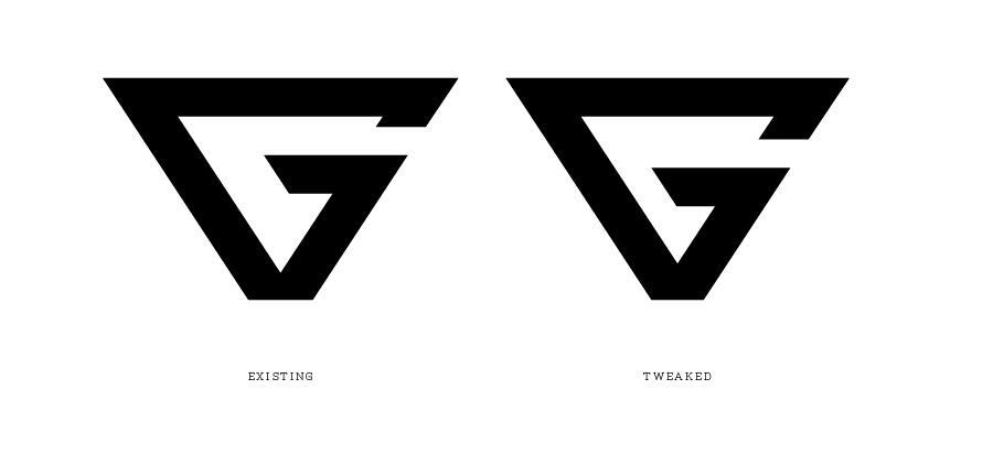 And then I stuck the G on, and re-weighted the letters so the uprights are a tad thicker than the horizontals to give it an optical sameness... 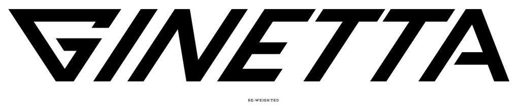 So so far I've gone from here to there...  The G is still not right, the A is DEFINITELY not right, and I'm still fighting the open space in the second half of the logo versus the quick succession of uprights that constitute the first half. This means one half of the logo has different spacing optically not literally, and needs to be smoothed out. The double T's need their horizontal stroke lengths adjusted and then whole thing then re-spaced. |
| |
Last Edit: Jun 15, 2019 17:19:09 GMT by Deleted
|
|
glenanderson
Club Retro Rides Member
Posts: 4,089
Club RR Member Number: 64
|
This was the NAUGHTY CORNERglenanderson
@glenanderson
Club Retro Rides Member 64
|
Jun 15, 2019 17:40:14 GMT
|
|
The left side of the G needs to be the same as the right side of the A... maybe... 😂
|
| |
My worst worry about dying is my wife selling my stuff for what I told her it cost...
|
|
|
|
|
Jun 15, 2019 17:46:15 GMT
|
The left side of the G needs to be the same as the right side of the A... maybe... 😂 In theory yes, and I pondered that myself. But it's also their standalone logo and needs to be symmetrical else it will look wonky in isolation. If I do any more tweaks it will be to remove some of the width from the top of the G... essentially base it on a narrower triangle. But that will then re-skew all the letters and they'll all need to be re-drawn so they fall off the new angle of the G. In a way whats nice about the logo letterform is it's way beyond merely italic, it's a very fast vertical, and reducing the extreme slant would visually slow the logo down. Not such a good tweak for a performance car brand maybe. |
| |
|
|
|
|
This was the NAUGHTY CORNERjohnthesparky
@johnthesparky
Club Retro Rides Member 6
|
Jun 15, 2019 17:47:10 GMT
|
|
It’s interesting that without the explanation, I can see a difference but I wouldn’t be able to see a difference
|
| |
|
|
|
|
|
Jun 15, 2019 18:18:39 GMT
|
It’s interesting that without the explanation, I can see a difference but I wouldn’t be able to see a difference Thats either a good thing: a tweak/update that discretely tightens things up without upsetting the customer base / audience / brand fans or A bad thing in the sense that it supprts the 'pointless' argument made previously... ie that minor tweaks make no difference and if it can't been seen clearly then nobody should bother. I'm torn personally. Bad logos eventually become good logos through repeat exposure and familiarity. I'm against radical re-branding of brands with heritage because it's always done to suit contemporary design whims and designers are too quick to throw away good history that merely happens to offend their delicate design sensibilities. Anyway... took a smidge of weight out of the N's diagonal as it looked two fat contrasting with its two opposing fast verticals. Had another go at re-spacing the letters a bit. Made the A wider by letting in a gutter at the apex to keep all the angles the same. I have made the G Assymetrical as far I would dare to go. They could have a symmetrical G for the standalone logo and a slightly tweaked one in the logotype as long as it wasn't obvious. So I've taken a tiny bit of angle out of the left hand side of the G. And then I decided to soften all the corners a little bit, but I think that's losing some of the brutal starkness of the original...  From That to This comparison...  |
| |
Last Edit: Jun 16, 2019 21:39:27 GMT by Deleted
|
|
|
|
|
Jun 16, 2019 21:25:16 GMT
|
Just won this in the TopGear thread. Another trophy for the Naughty Corner cabinet. ======================= THE NAUGHTY CORNER TROPHY CABINET -----------------------  ----------------------- ======================= |
| |
|
|
|
|
|
Jun 16, 2019 21:33:12 GMT
|
Just change it to Vienetta and be done with it.  |
| |
1968 Mini MkII, 1968 VW T1, 1967 VW T1, 1974 VW T1, 1974 VW T1 1303, 1975 Mini 1000 auto, 1979 Chevette, 1981 Cortina, 1978 Mini 1000 1981 Mini City, 1981 Mini van, 1974 Mini Clubman, 1982 Metro City, 1987 Escort, 1989 Lancia Y10, 1989 Cavalier, 1990 Sierra, 1990 Renault 19, 1993 Nova, 1990 Citroen BX, 1994 Ford Scorpio, 1990 Renault Clio, 2004 Citroen C3, 2006 Citroen C2, 2004 Citroen C4, 2013 Citroen DS5. 2017 DS3 130 Plenty of other scrappers!
|
|
|
|
|
Jun 16, 2019 21:46:25 GMT
|
|
Like this:
GINETTA
done.
|
| |
|
|
|
|
|
Jun 16, 2019 21:59:52 GMT
|
|
The font all looks bloody awful to me. The G is terrible - something from the 1970's tomorrows world.
As above, std font looks far better.
|
| |
|
|
|
|
|
Jun 16, 2019 22:06:47 GMT
|
|
I'm not designing a logo, I'm re-cutting what's already there. What they already have and have had from the start. I'm not trying to design a new logo or rebrand a company. I'm just re-cutting it for my own interest, to see what it looks like if its tidied up a bit.
Its laughable to me that anyone would say "just use a standard typeface". What is a standard typeface firstly? Secondly though do you want to live in a world where everything is a standard typeface?
What a dreary world that would be!
|
| |
|
|
jpsmit
Posted a lot

Posts: 1,254
|
|
|
|
|
Wondering about making the right stroke on the A vertical. then a little a-symmetry makes it interesting (also looks a little more like a rocket or some such shape)
|
| |
|
|
|
|
|
|
|
Wondering about making the right stroke on the A vertical. then a little a-symmetry makes it interesting (also looks a little more like a rocket or some such shape) Yeah that could be interesting to try. It would require a slightly odd A though because simply making it vertical as it stands now, it would end up being less than half the width of the other letters so it would leap out as really odd. But it could be done be introducing a horizontal bar on the A instead of a sharp apex, and that might have moree of a nod to the original. Just did a quick bodge up in Powerpoint to see how it might look...  I doubt I'll be having any more dabbles on the Ginetta logo now. I've scratched the slightly OCD itch of seeing the badly kerned logo and satisfying myself it could be sorted out. I might have a go at Blackpop's lettering next. |
| |
Last Edit: Jun 17, 2019 7:53:34 GMT by Deleted
|
|
|
|
|
|
|
|
Deleted: Double post
|
| |
Last Edit: Jun 17, 2019 9:32:43 GMT by Deleted
|
|


